
In 2009, web fonts emerged into the world with browser now supporting font-face definitions in CSS, which then became mainstream with the help of the Typekit project (now Adobe Fonts) and Google fonts.
Before this, you only had a choice of about 3-5 fonts and some brands would just use images with text in them to fabricate branded typography in web experiences.
 Don’t get me wrong, I was guilty of this too (to the right is a small screengrab from one of my startups at this time) you gotta love the woodgrain.
Why do we desire custom fonts so much?
Laura Worthington put it best when she said “type is a visual voice. Without reading, it imparts its message” and that message in most cases is how you connect a brand your visitor with your brand. When used properly, web typography can:
- Give a brand meaning
- Define how someone experiences a brand
- Change perception and build brand recognition
But there are still challenges with web fonts even in 2022 that can directly impact the experience of end users. With 68% of websites using web fonts, it’s important to understand some of the dynamics that impact experience. To get to the root of the problem, let’s start by talking about how fonts work on the web.
How fonts work on the web
A website stores all content/text in plain text and HTML, this text then needs to be told which font to use to display it. For the font to be displayed, it either must be on the visitor’s device or be delivered alongside the website so that it can be interpreted by the browser.
This is determined by telling the website how to render different fonts by using a font stack, which is defined in CSS like this:
font-family: “Century Gothic”, Arial, Helvetica, sans-serif;
This code as an example would attempt to use “Century Gothic” first. But approximately 10-20% of global visitors don’t have this font, so it would then attempt to load Arial, then Helvetica, and finally a sans-serif alternative.
This concept illustrates what is considered a web-safe font, which is available to all visitors regardless of device. The challenge is that across desktop and mobile devices there is very little overlap across serif and sans-serif web-safe fonts.
So what does this mean for us?
When considering using custom or system-provided fonts, you need to determine that if a font isn’t available, how it will fall back to other fonts that hopefully the device has installed.
With that understanding, we have the freedom to consider using:
- Web fonts, which are not installed on a system and may be custom, allow a brand’s typography to connect to the brand
- System fonts, which are installed on a device by default allow the typography to be extremely readable and quick to display.
The remainder of this article will discuss the delicate balance of using both web and system fonts.
Using Web Fonts
Just like a desktop using new fonts, a browser requires a font with an extension .ttf, .otf, or .woff, unfortunately, different browsers support different extensions although modern browsers are making this simpler.
Custom fonts need to be converted into these many formats and served up for the HTML to reference. To make this experience easier for designers and developers fonts are often used from Typekit, GoogleFonts, or icon-based fonts from FontAwesome.
These technologies make it easy to add custom fonts, but they create significant issues.
Challenge #1: Fonts can impact performance, which can damage the experience
Because fonts require a network request to load a font file, they can become render blocking. Based on the implementation of the fonts, it could block the web page from showing anything or it can take off crucial bandwidth needed to load critical parts of your page page. This is especially important when you consider mobile devices with limited connections.
Take for example this screenshot taken from a performance audit from a large e-commerce company (their exact files are redacted).
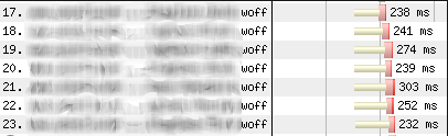
This example shows that 7 different fonts are being loaded before the actual content of the website is rendered.
The amount of fonts and when they are loaded directly impacts the speed of rendering the experience, which is contained in several Web Vital metrics. Designs with heavy imagery and fonts can slow down how fast a web page responds and that matters because 53% of mobile users abandon sites that take over 3 seconds to load.
Recommendation: Limit the amount of web fonts used
A design may look beautiful in your design tool of choice, but how it translates to the web may differ dramatically as you see it’s impact on performance.
To reduce the performance impact of web fonts, I recommend limiting the above the fold requires web fonts to one file. From there, if more fonts are required plan for them to be lazy loaded or loaded below the fold of the page.
Challenge #2: Content shifts when fonts load, frustrating users
Once we clean up some of the blocking font issues, we will then need to focus on the swap of fonts as they load. Below is an example of a webpage with the default system font on the left and then a delayed load of the font to the right.
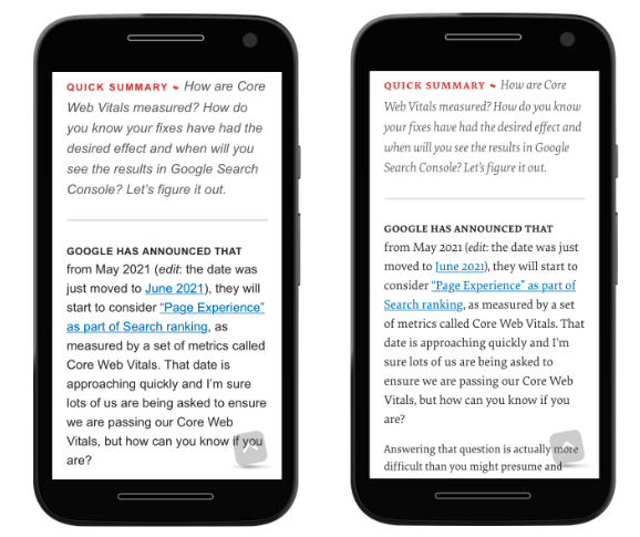
If not dont correctly, the swap from the default font to the web font will adjust the whole layout of the page, another Web Vital metric called Cumulative Layout Shift.
The loading of fonts can interfere with interaction as well as generally frustrate the user as they engage with the website.
Recommendation: Match web fonts to more commonly supported system fonts
The reason that this swap behavior occurs is that fonts have additional parameters other than size, their line-height, weight, letter spacing, word spacing, etc. Many times the web font and the system fonts are totally out of sync.
The good news is that this is solvable with a bit of trial and error to make sure that fonts match across these parameters.
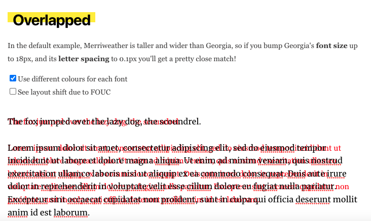
To make this experimentation easier, I usually use Font Style Matcher provided by Monica Dinculescu.
This awesome tool helps visualize and tweak these settings so that a developer can implement it. Below is a screenshot of the output of the tool.
Challenge #3: Loading fonts from 3rd parties can create privacy concerns
Custom font solutions often use a 3rd party domain to host fonts. However, because it is a 3rd party domain, these solutions have been started to raise significant privacy concerns.
On January 20, 2022, a court in Germany ruled that Google Fonts captured IP addresses, which is considered a violation of GDPR. To resolve this issue, websites that require GDPR compliance require consent before connecting to the 3rd party system, meaning that for a period of time custom fonts would not load at all.
I see this trend continuing as many brands are mindful of privacy and consent of their expereiences.
Recommendation: Self host your fonts, while still using a CDN
This challenge may be one of the simplest to resolve. If you are using a web font, you should self-host the files as opposed to leveraging a 3rd party CDN. This will take additional development work but will be well worth the effort to steer clear of GDPR compliance issues.
Using System Fonts
We’ve talked a lot about web fonts so far, but even when using a web font, you will want to fallback to system fonts if the custom font fails to load.
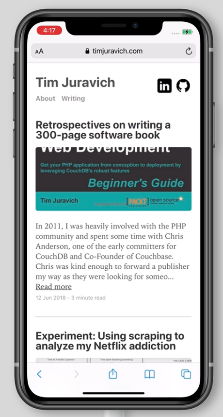
As an example of using only system fonts, this website completely relies upon a devices browser stack to pick the most readable font depending on the device of the user.
This is incredibly useful on this site because it makes the content the most readable on the targeted device and there are zero calls to custom fonts. Below are quick screenshots from iOS, Android, Windows, and Mac.


This can be very useful for body content in connection with web fonts to make the content readable and performance.
To do research on some of the “web-safe” system fonts, I like to use CSS Font Stack, which contains high-level support and coverage across platforms.
If you are curious, this website follows the System Font Stack pattern.
Parting Thoughts
Custom fonts are wonderful to connect key parts of a web experience with a brand, but I recommend using them sparingly and in line with some of the guidance above.